Statement looks
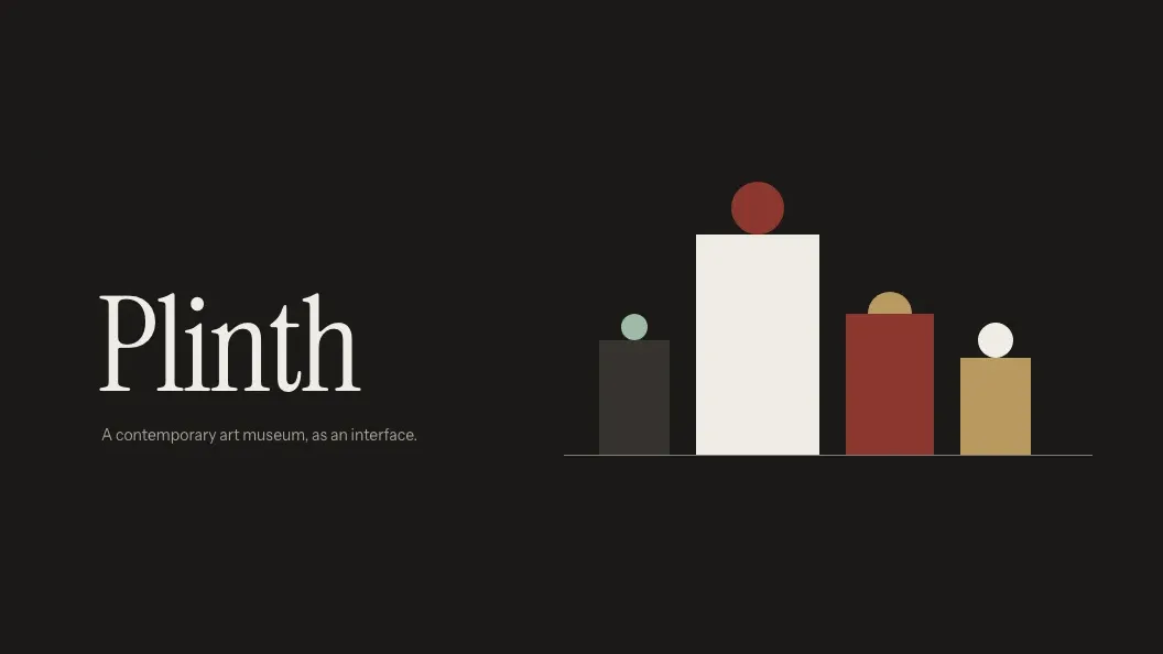
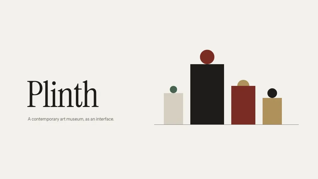
Plinth
A contemporary art museum as UI: frames that settle level, plinth cards, wall-label tips, spotlight hovers.
- Components
- 20
- Widgets
- 4
- Examples
- 2
- Themes
- 2
This is the pack's real, runnable example — rendered live by its own CSS and JS, exactly as it ships. Open it full-screen →
Use this design
One line in .env re-skins your whole public site — fonts, colours, components, both themes. No build step, nothing to install: the pack is already vendored in your copy.
- 2 themes: Light — day gallery / Dark — evening hours — the in-app toggle switches between them.
- Fonts (Instrument Serif, Instrument Sans) are self-hosted in the pack. Zero third-party requests, no CDN, GDPR-calm.
- Prefer the house look with your own colours? The appearance page has 20 accent palettes for it.
# .env
SITE_DESIGN="plinth"Every screen, both themes
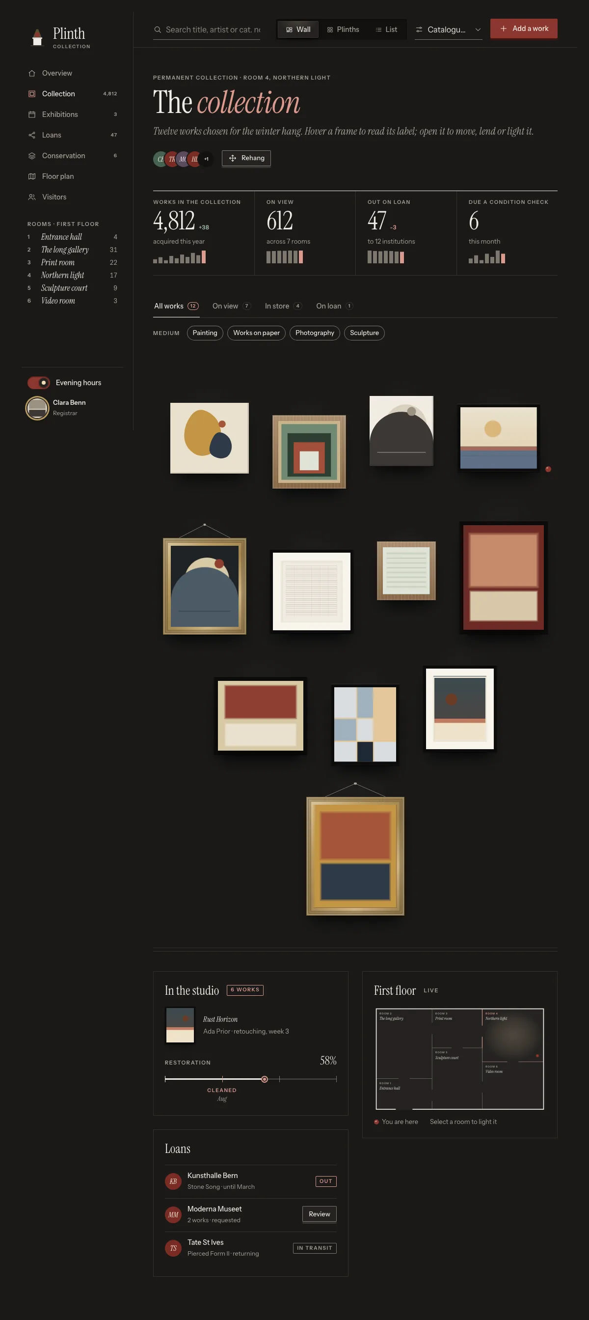
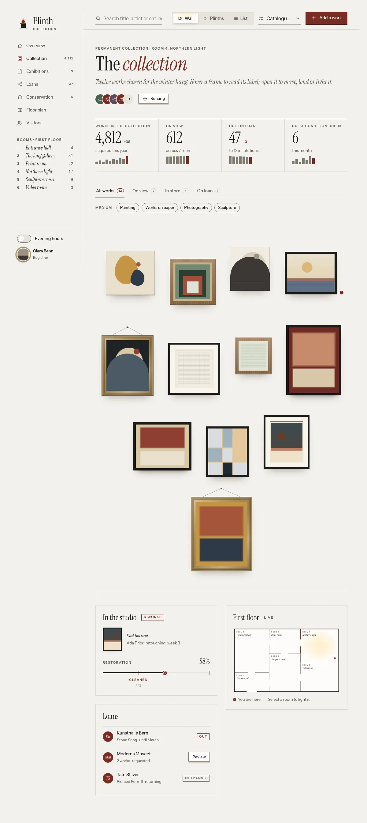
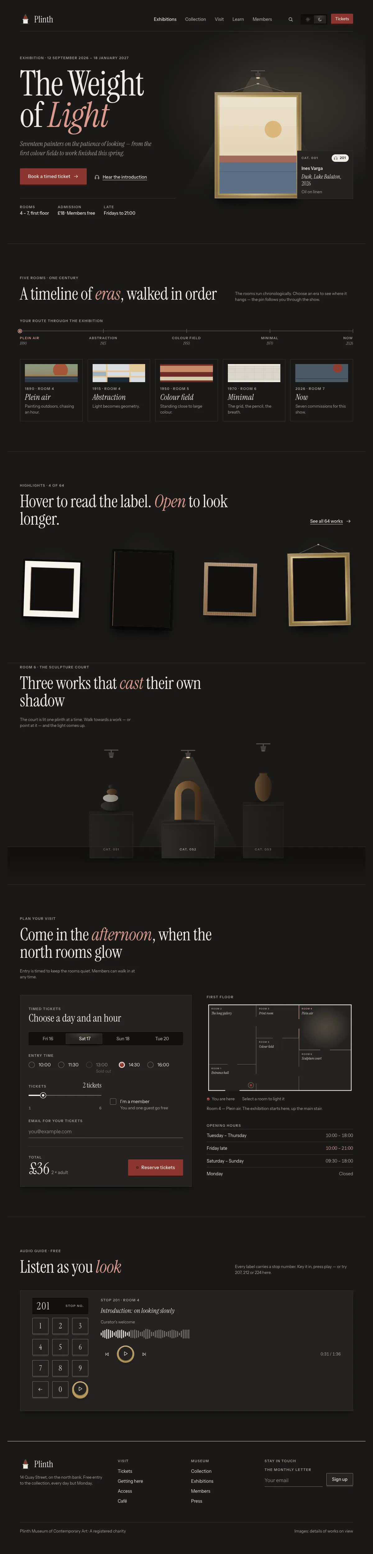
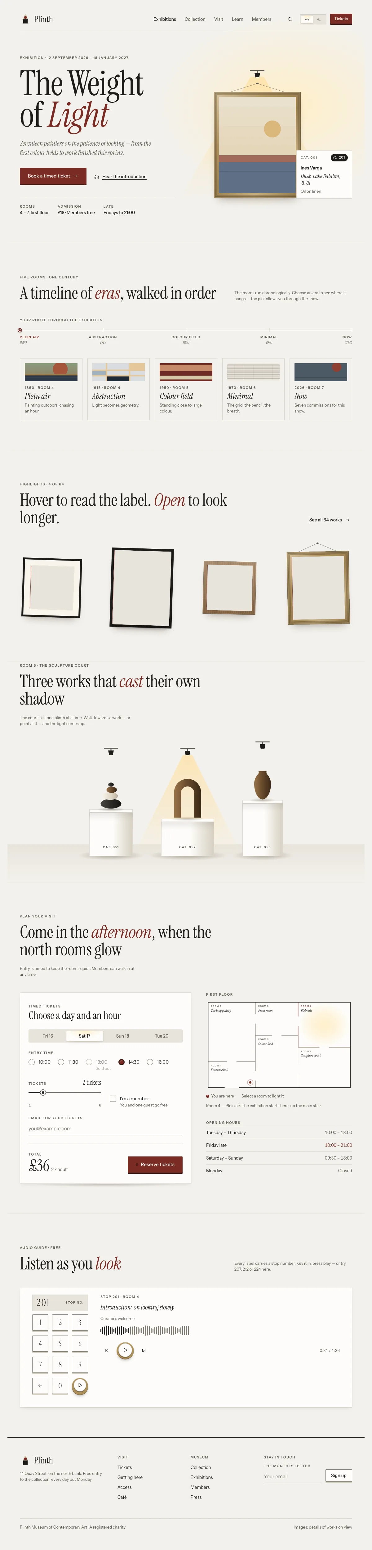
More like this
 AzulejoStatement looks
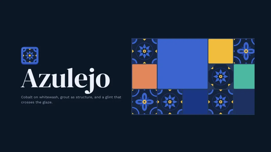
Glazed Portuguese tiles: cobalt patterns, grout-set buttons, flipping cards and a mosaic that cascades in.
 BauhausStatement looks
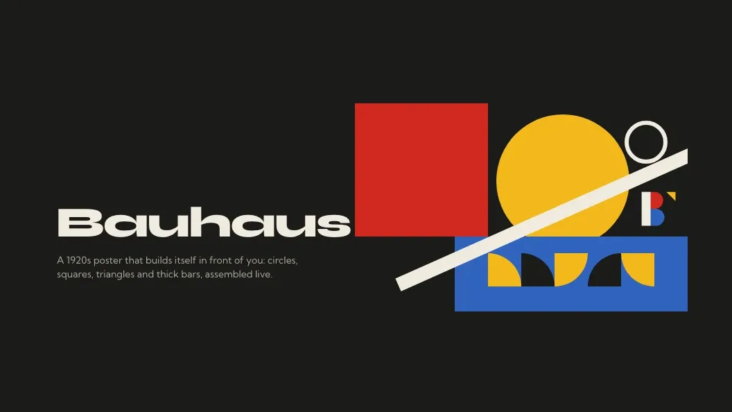
A 1920s Bauhaus poster as live UI: shapes slide, roll and click into place; generative seeded compositions.
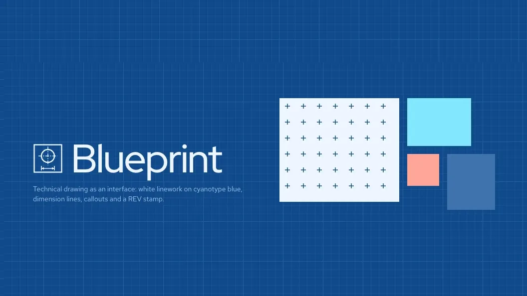 BlueprintStatement looks
Technical drawing as UI: outlines trace on, cards show their dimensions, saves land a redline REV stamp